7 de Noviembre 2004
Graphically speaking, who has the better poster? (Before&After Magazine)
 |
|
|---|
GEORGE BUSH
Remember, were not talking politics or personalities or platforms; this is a design discussion, and what we want to know is which design does the best job of conveying the attributes of its candidate.
But its no contest, really. Design at its best is definite and intentional; every element, shape, color and space is there for a reason and works to articulate a coherent message.
The Bush Cheney logo does this. It is compact, concise, forward-moving and energetic. From the presidential navy blue field to the muscular, right-leaning type to the bold, stylized flag, every element works to convey power, clarity and decisiveness. The visual message is of a man who knows what he stands for and where hes going -- and agree with him or not, the image leaves the viewer no wiggle room, no possibility of another interpretation.
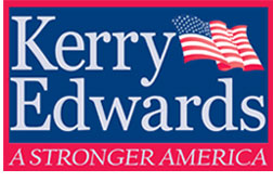
Kerry Edwards is the opposite. Its thin, serif typeface is overwhelmed on a poster -- detailed, fussy, dominated by the blue behind it. Had it been carefully chosen and beautifully set, the type could have conveyed intelligence, literacy and heritage -- all Kerry attributes -- but it doesnt; its just an ordinary font set the way one would type it: two words the same size, mostly lowercase, flush left -- a thoughtless presentation that makes Edwards dominant and leaves an empty rectangle in the upper right corner, which was then filled with a flag. There was no plan; the words defined the shapes, which then determined what could fill them. Result: an ambiguous placard lacking presence, vision, motion, point and purpose.
If the election rested on the candidates posters, we wouldnt even need exit polls to call the winner. The actual outcome, of course, remains to be seen.
Escrito por Loreto Pascual a las 7 de Noviembre 2004 a las 02:24 PM